Rembrandt's great orchestration.
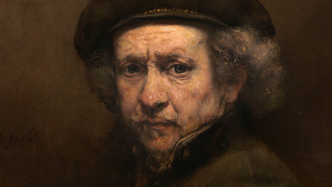
Rembrandt self portrait, 1659.
The National gallery has just hosted one of the most impressive exhibitions of Rembrandt's late works. If you missed it, you'll have a chance to see it next in Amsterdam at the Rijksmuseum (12 February-17 May 2015)
Without an advance online booking, I arrived on the first day at opening time, and was faced with a demoralising queue stretching all the way outside the building. At the information desk, a man told me this was only going to get worse as it was the last week, and said "it's crazy, it's just like the queues of people waiting for the next iphone!". Next time you walk past an Mac store, and people are queuing for the next iphone, please think to yourself "it's crazy, it's like people queuing for a Rembrandt show!"
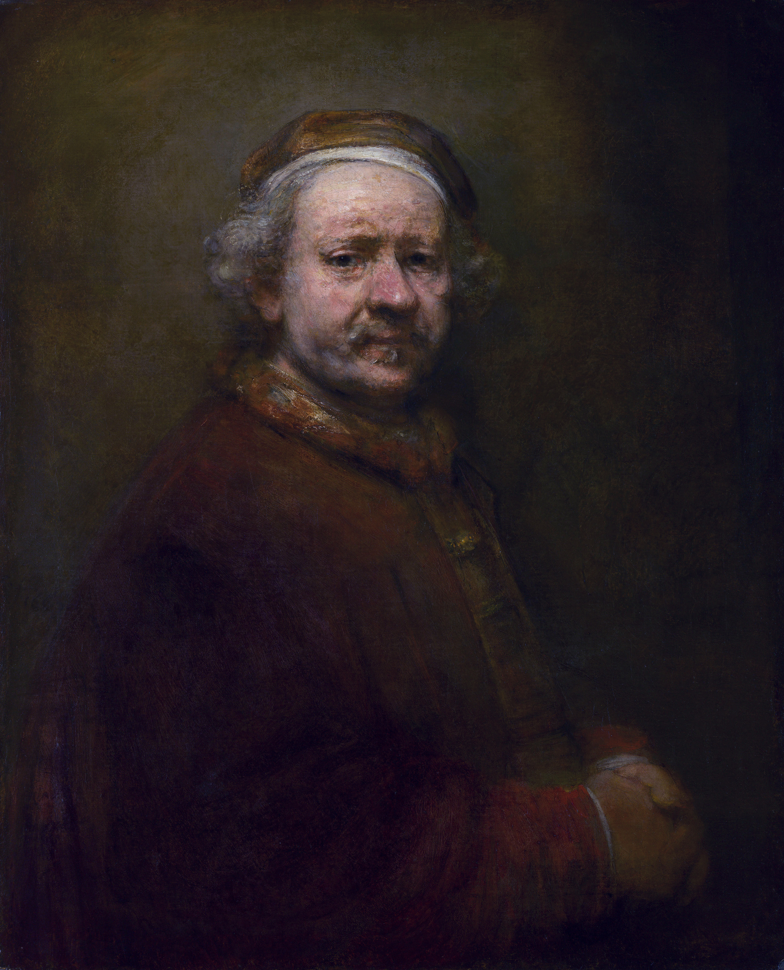
Self-portraits 1659, 1661, 1669, 1669, 1665-1669. Exhibited in this chronological order.
When viewed all in line, what becomes obvious is the recurring set of colour motifs: White, yellow (gold), red, black. Influenced by the limited palette available at the time. They are all lit from the left, sitter facing right, except the first one in the series.
The show altogether was great, but I was particularly interested in the self-portrait room, where the first 4 self portraits glow out from the shadows, which you could look at all together and compare to one another. The 5th painting, with the 2 circles in the background (much speculation to their significance) was in the next room, due to its larger size. There were some clear differences in how he handled his subject, the paint, the focus, the set-up.
What I offer here are my observations while I faced the paintings close up; scrutinising the paint surface, analysing how different areas were handled, what choices were made. Clearly, much has already been written about the fantastic paint handling, the fleshiness of the paint, the compositional structures etc. But I write here as a painter fascinated with the different approaches in each image, and curious about the many different "cogs" that all align seamlessly in the great "wheel" that is, a Rembrandt self-portrait.
#1. 1659. Warm thick paint covers a green/grey cold base layer- redest point is the tip of the nose. Noticeable points: cast shadow of cap onto forehead is sharp at center, fades away on edges of temples. Striking green/grey ground coming through at corner of eye on right, eyebrows, temple on right, edges of nostrils. Brim of cap and collar are more in focus than the whole face.
#2. As the Apostle Paul, 1661. Shadows on face are luminous, full of ochre, suggesting ambient reverberating light, perhaps from parchment in hand. Darkest accents are firstly the eyes, then eyebrows & nostrils. The shaft of light (from top left to bottom right) is enabled by passing through the white turban, unlike the previous painting, where the black cap interrupts it. In reproductions such as this one, it's obvious, but in the darkness of the museums, I had never noticed the dagger poking out of the jacket before.
#3. At the age of 63, 1669. Sharp little accent on the right of the bridge of his nose, really pulls it forward in front of the eye socket. Cap is softer, as it recedes over the skull. The focal depth is more reduced than previous 2 paintings. Eyes and nose are in focus, but beyond the cheekbone plane, things soften quickly. Previous 2, the sharp focus remains throughout a deeper depth of field. Face is bathed in more light, and shadows appear darker. Brushwork is complex, with dappled effects throughout all areas, even throughout the apparently smooth and unified lit forehead.
#4. 1669. Smoother in lights (cheek & temple area), less texture and dappled effects than previous ones. Surprising streaks of red in shadows, behind a cold mid-tone accent, and a red dash at the corner of nostril (on left), behind a cold accent on lid of nostril. Both of these go against the usual temperature manipulation of colour to make space recede or advance. Warm accent in corner of left eye socket.
#5. With two circles, about 1665-1660. As far as technique is concerned, this seems like a mix of #3 and #4. The luminous shadow on the face darkens on the way down. It’s back to a textural surface, with some dappled passages. The white cap seems to be made of 3 or 4 thick brush strokes, and along with the white undershirt, frames the head from above and below.
These portraits are a great lesson in how modelling of form can be handled not only through tone, but subtle colour shifts of temperature (colds recede, warms advance). The green/grey ground in #1 comes through gaps of unpainted areas, to allow form to recede. It's common to see the tip of the nose red, whilst the edge of the temples are grey. But interestingly, in #4, temperature "rules" seem to be broken, with several warm accents within a recess, lying behind cooler tones: Red streaks in far cheek shadow; red accent inside the recess of the eye socket; more red behind nostril than on tip of nose.
When staring at all of them together again, it is clear that the focal depth of each painting seem to narrow over the years. As if a mist is drawn in from the background to envelop the details of anything behind the eye and nose areas. Rembrandt is clearly prioritising when it comes to what features remain prominent, and which ones disappear. He creates a set of engaging anchor points for the viewer to get hooked on, and avoids unnecessary peripheral visual chatter. This juggling of textures, and handling of edges makes for one of the greatest lessons in orchestration by any artist.
P.S Another strong self-portrait (At age 51), that doesn't fit in the timeline of this exhibit, can be found in Edinburgh's National Gallery.


